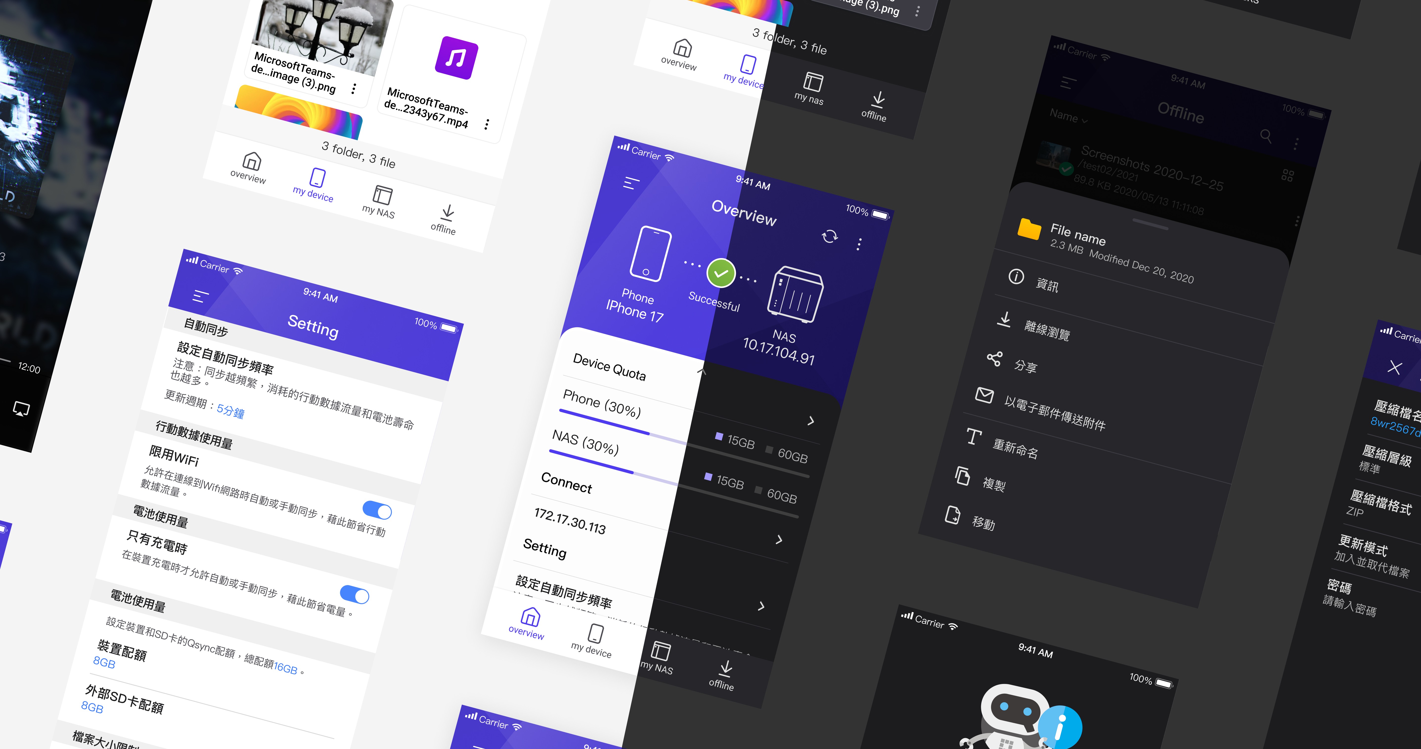
NAS Cross-Device Sync App
A cross-device cloud sync app for seamless file collaboration. Addressing the confusing navigation of the original version, I led the mobile experience redesign through usability testing and rapid prototyping. The new streamlined workflow and information architecture received highly positive validation, effectively resolving core usability issues and laying a solid foundation for future product growth.
Project info
Team
1 Product Designer, 1 Product Manager, 4 Mobile Engineers (2 Android, 2 iOS), 2 Backend Engineers, 1 QA Engineer
Duration
4 months
Role
User Research Planning & Execution, End-to-End UI/UX Design
Project Background
I know it's secure, but I really don't know how to use it.
This is a NAS sync and backup tool that allows users to securely access and sync files across platforms (Windows, macOS, and mobile). However, as global cloud backup services have become common, users expect more than just security. They want speed, simplicity, and reliability. Multiple rounds of user feedback revealed that users found the product difficult to use.
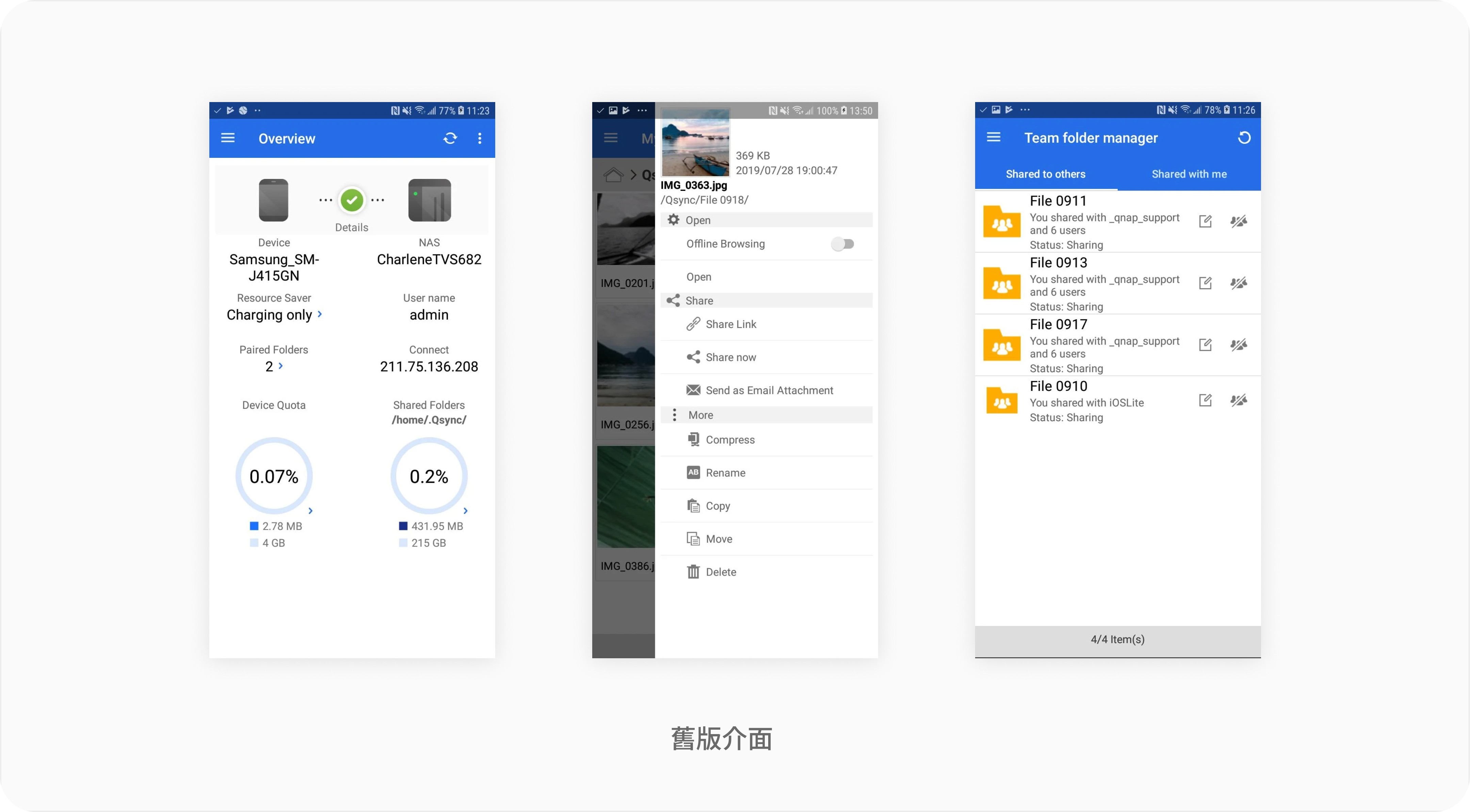
The goal was to redefine the user experience, shifting the product from a "technical backup tool" to an "accessible backup assistant for everyone."
Key Objectives:
1. Expand the user base and lower the learning curve.
2. Modernize the interface to improve usability and brand consistency.
2. Reinforce security and trust to maintain our private cloud advantage.
Project Process
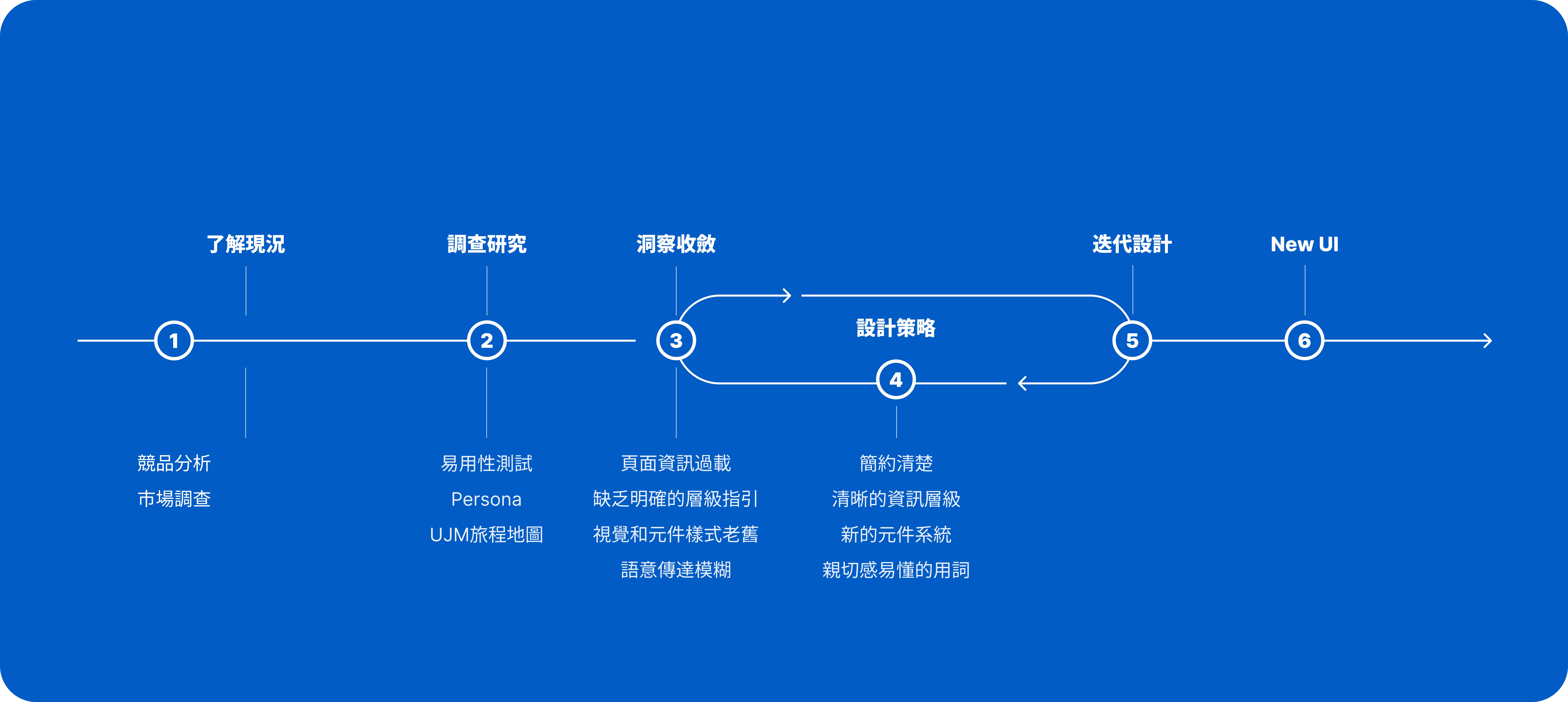
User Research
To deeply understand user mental models, expectations, and frustrations, I used the System Usability Scale (SUS) to gather quantitative metrics. This allowed me to audit the interface from a user's perspective, clarify current usability levels, and identify which experiences needed immediate improvement.
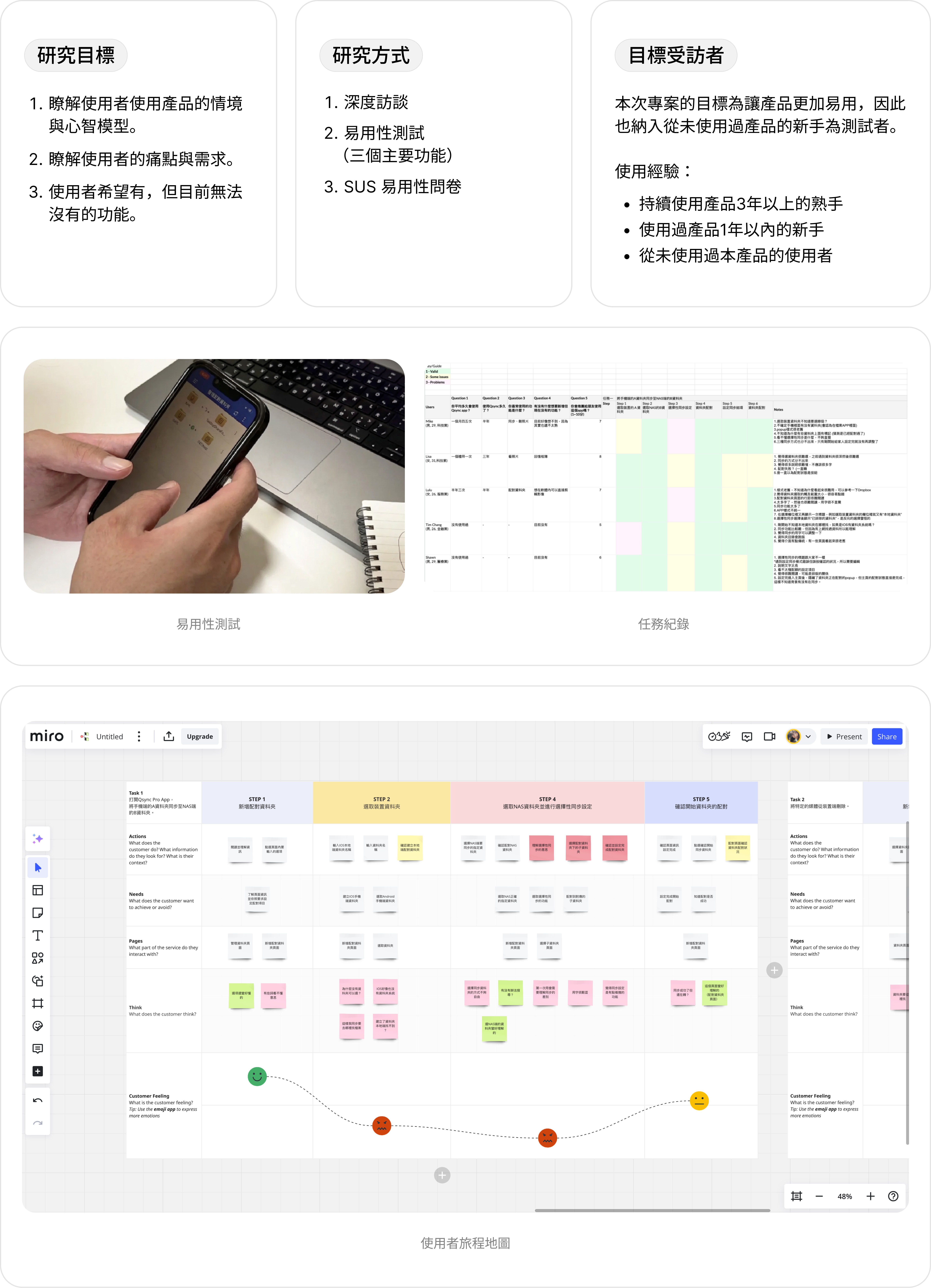
I conducted usability testing and qualitative interviews with 8 users. These sessions revealed several key pain points:
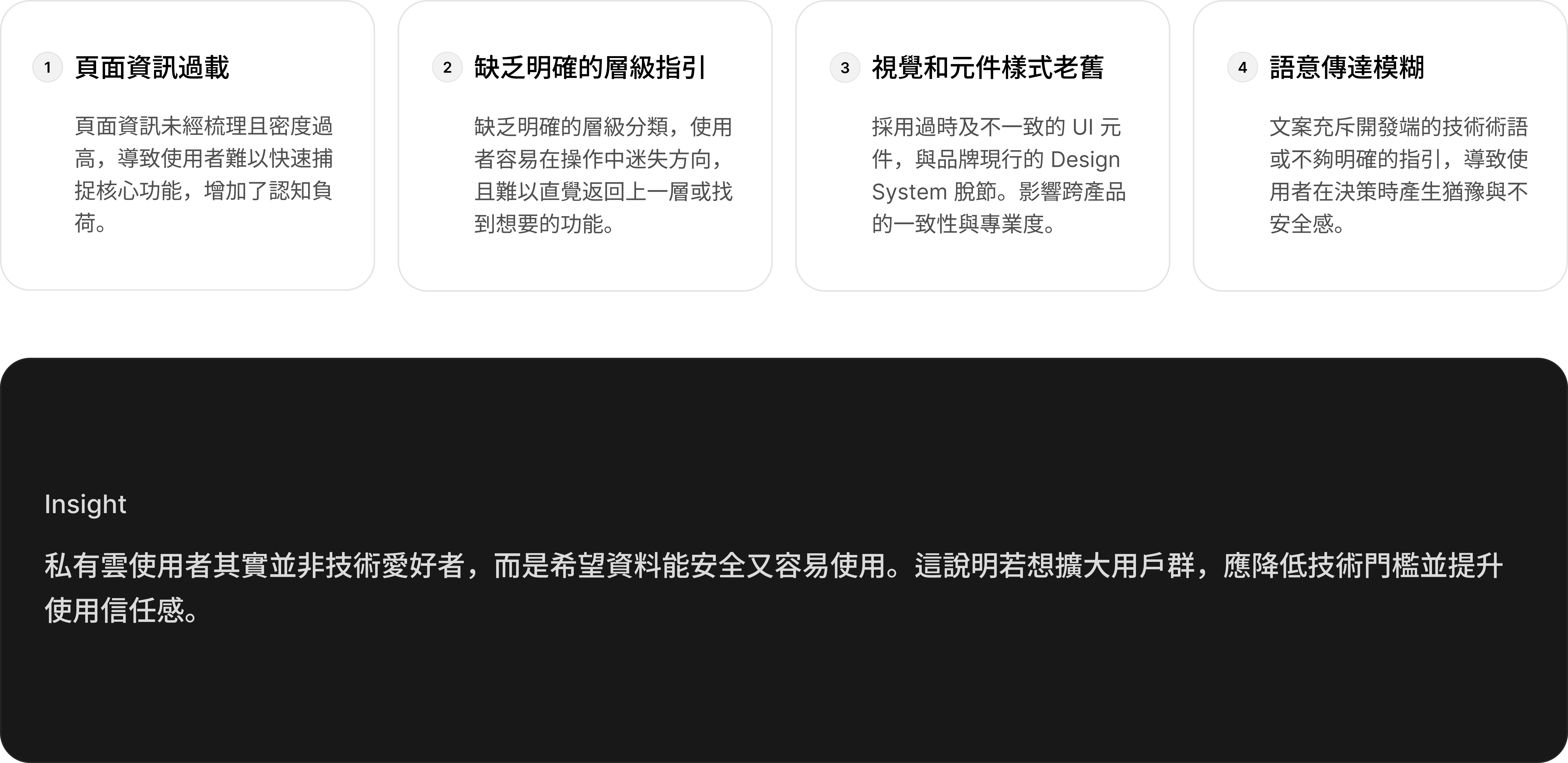
How Might We Workshop
Based on user insights, I facilitated a How Might We workshop to transform usability issues into actionable next steps for the team. The workshop process is outlined below:
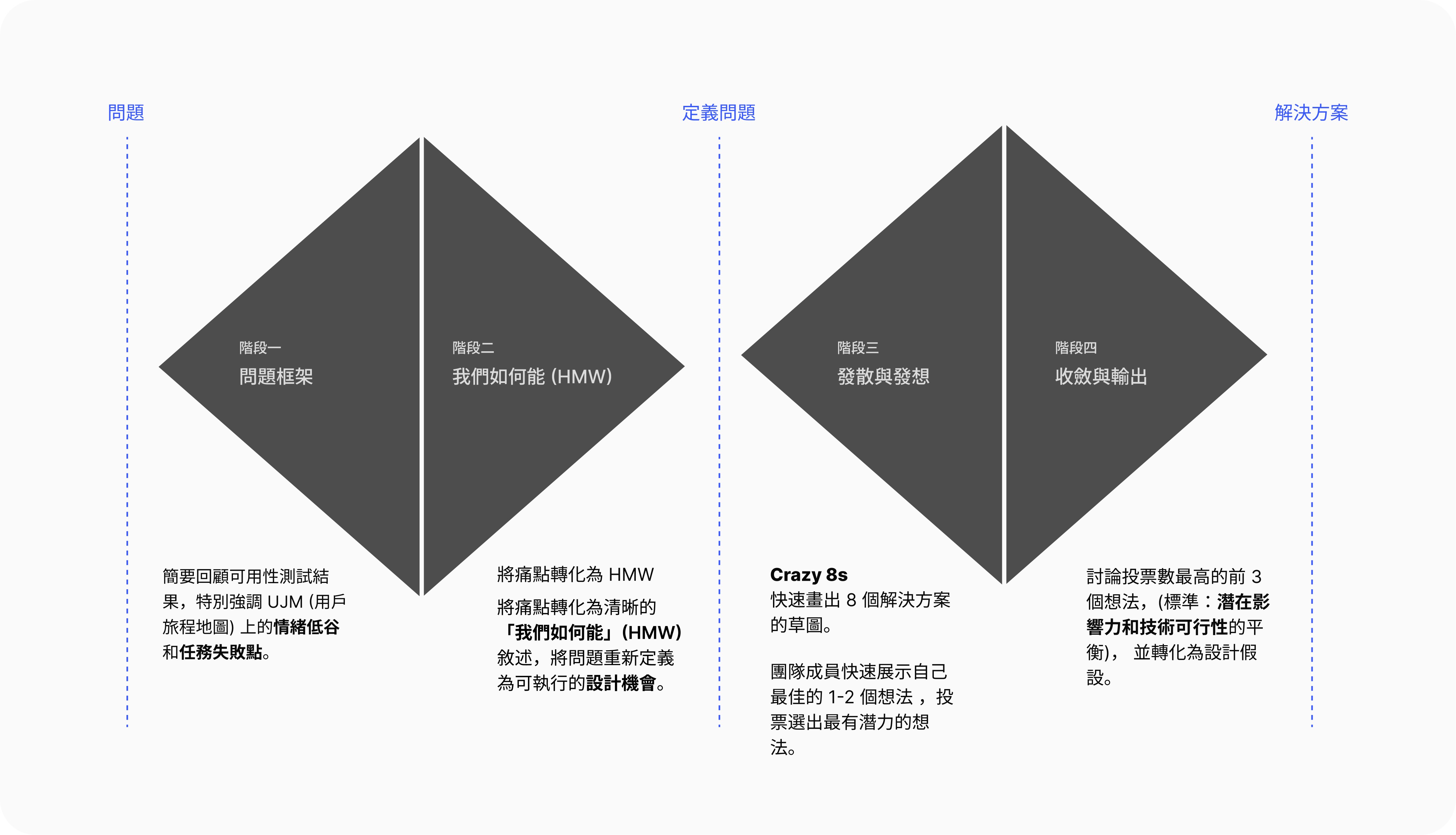
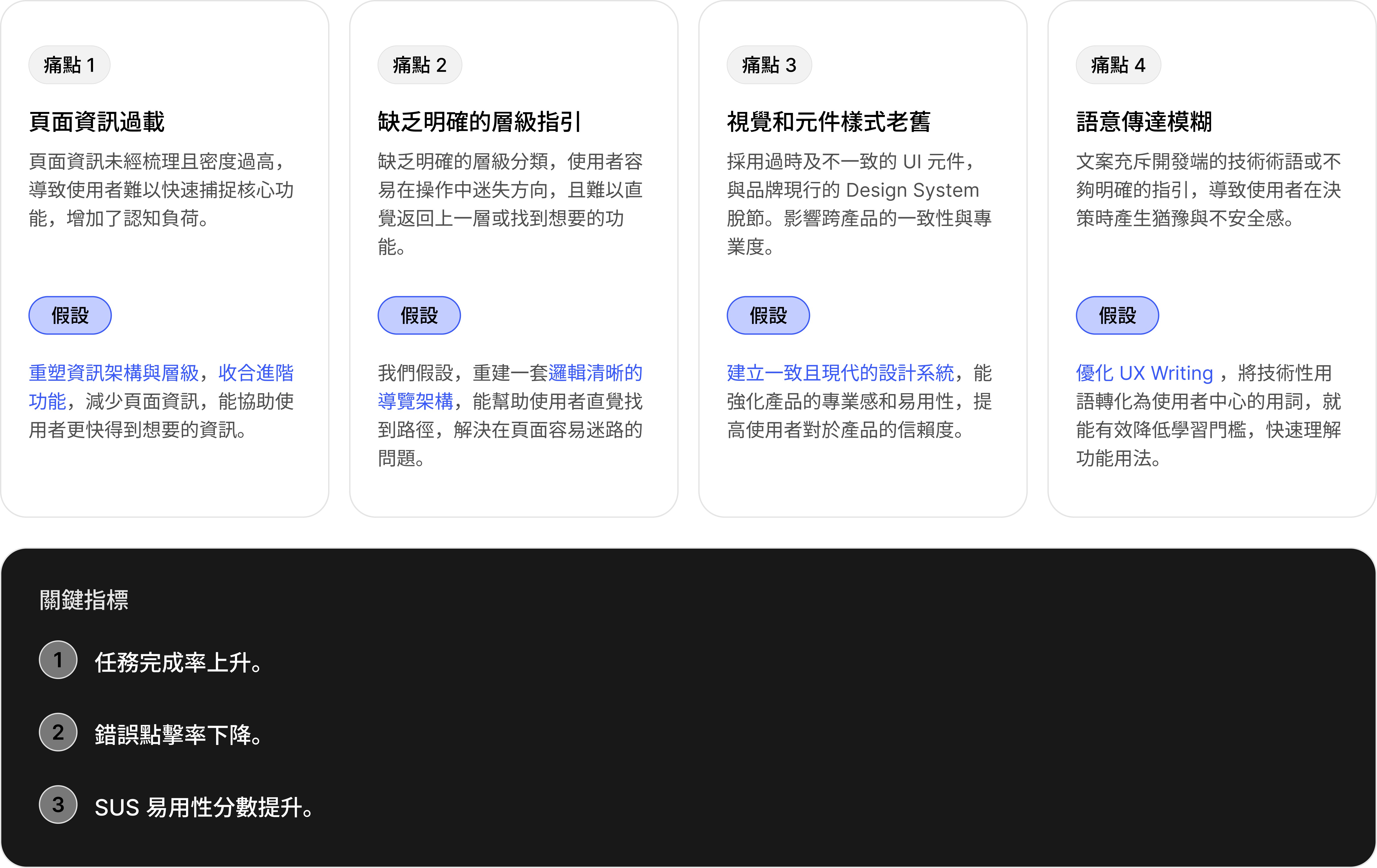
In the workshop, we collaboratively defined design hypotheses based on core pain points and planned key validation metrics.
Design Strategy
Based on research findings, I proposed three design principles to serve as the core strategy for the revamp:

Design Deliverables
Given the tight development timeline, we gathered user feedback on the new interface through rapid testing within two weeks and iterated on the design. Here are our final results:
Improved Information Hierarchy & Navigation
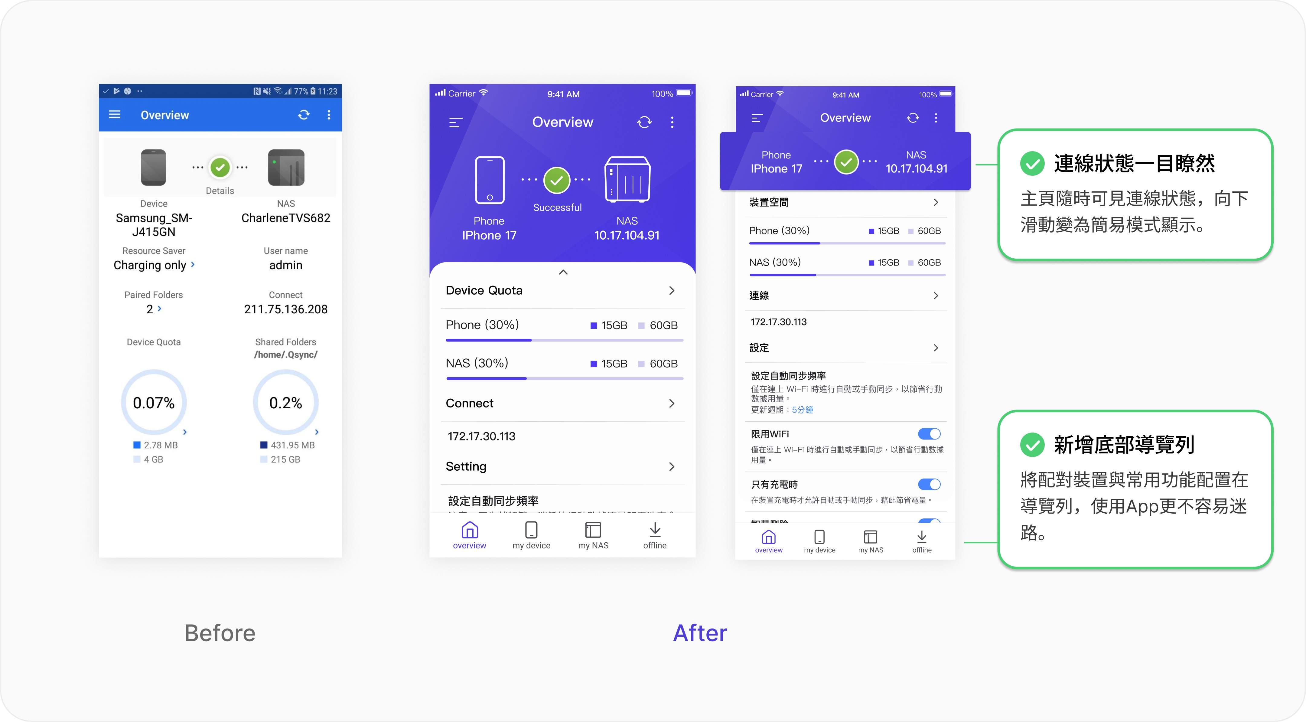
The original homepage lacked visual hierarchy, making it difficult for users to grasp sync status and storage capacity. I reorganized the layout into modular sections. Based on user research, I prioritized content to better match user needs and habits.
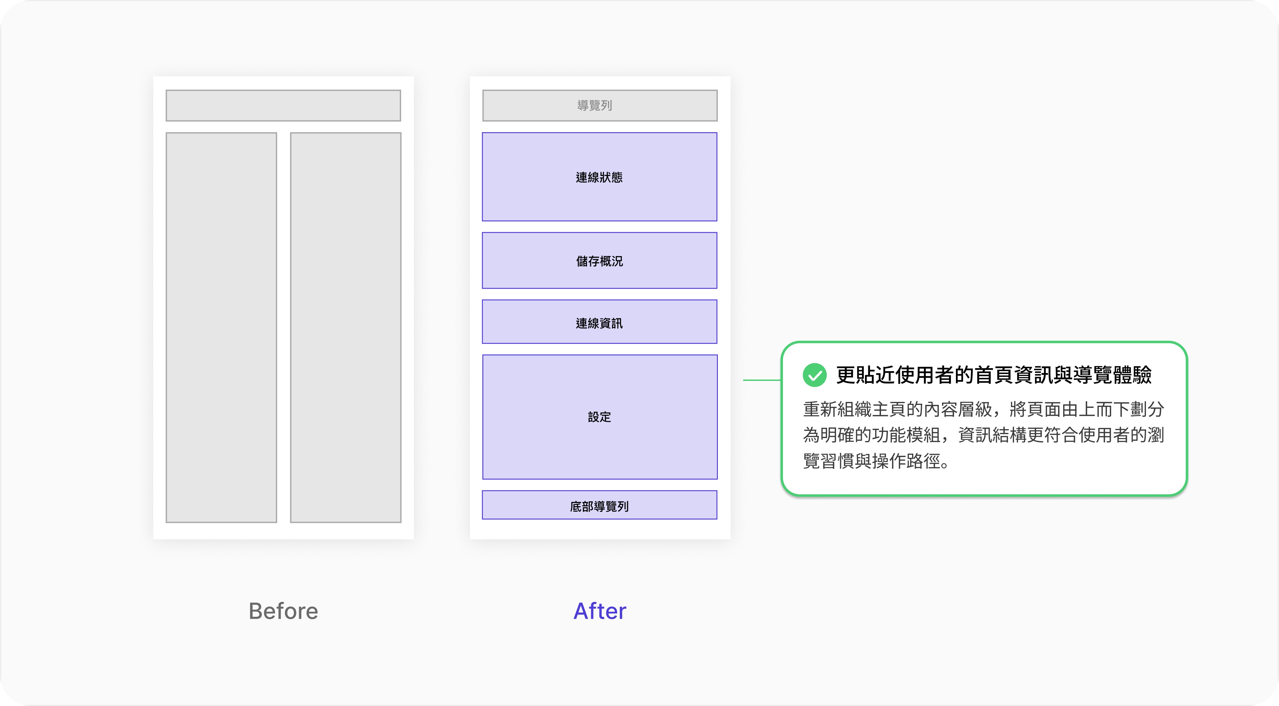
Research also revealed that users often got lost when switching between features. I introduced a bottom navigation bar to help users find features quickly and switch between them intuitively.
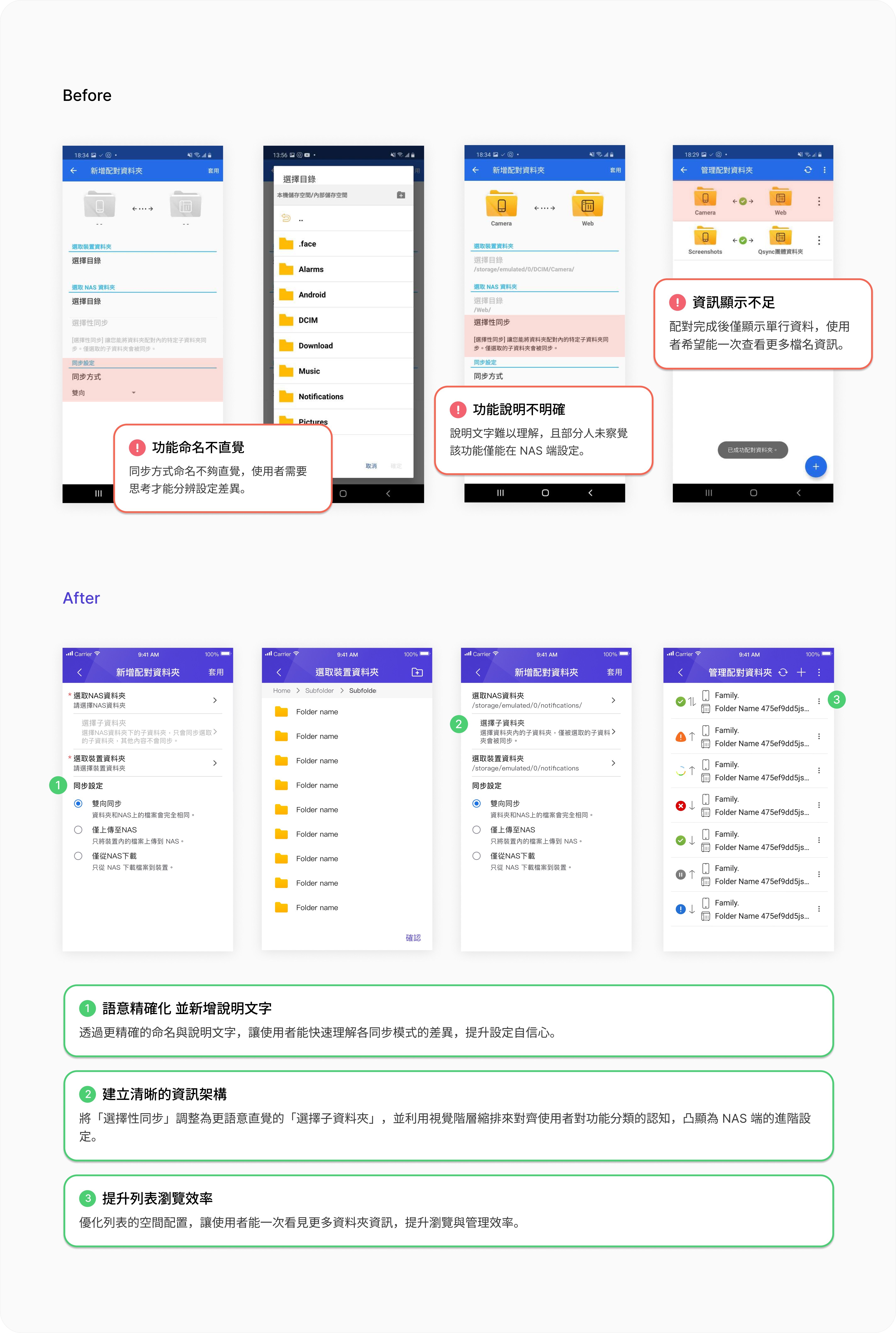
Intuitive Sync Setup Process
The original term "Selective Sync" was too technical and confusing. We translated it to "Select Subfolders" to better match user mental models. We also applied a clear indented style to make complex NAS settings easy to scan at a glance.
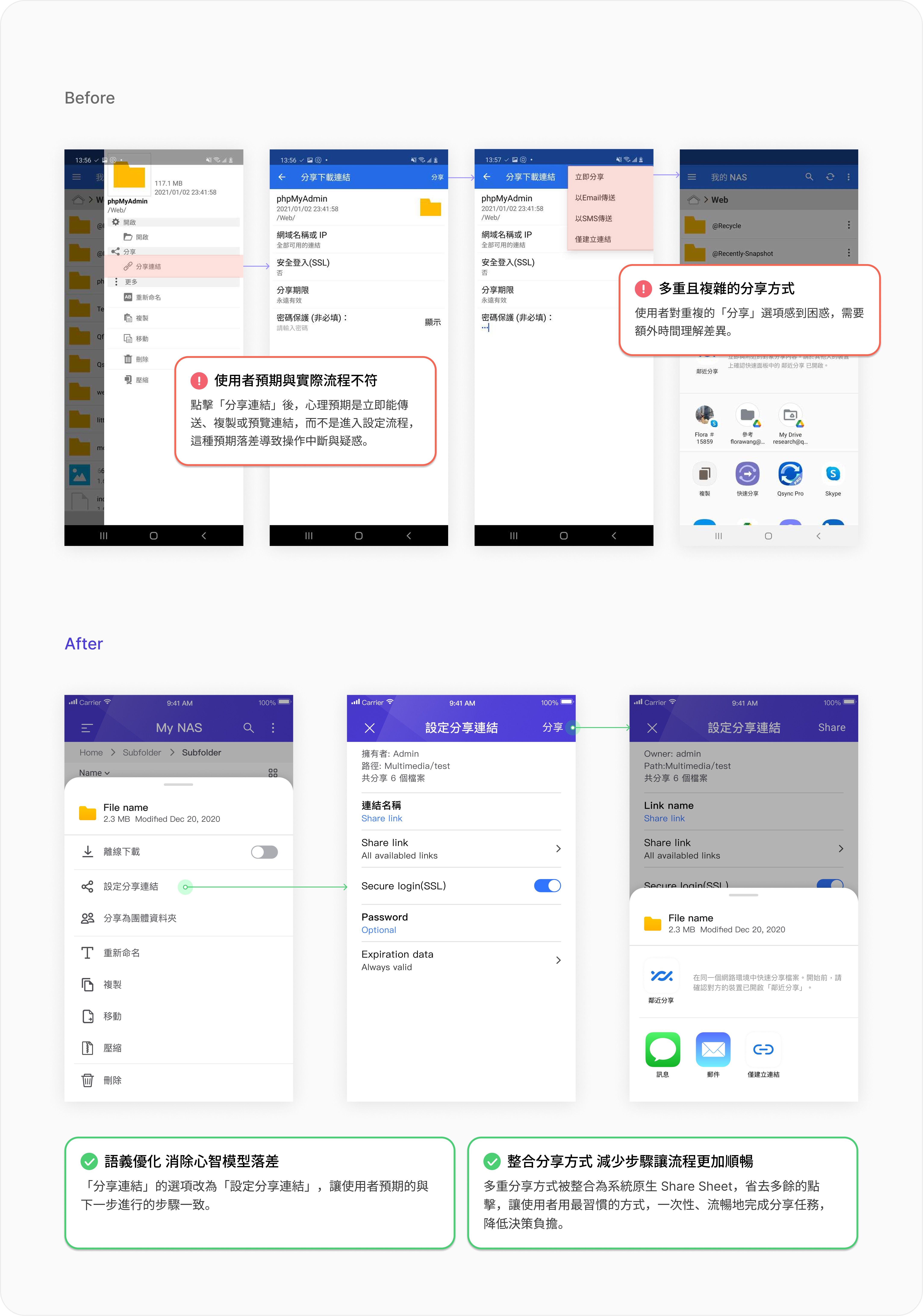
Faster, Clearer Sharing
I redesigned the sharing flow by integrating settings, link generation, and copying into a single path. This ensures users clearly understand what they are creating, who will see it, and how to share it.
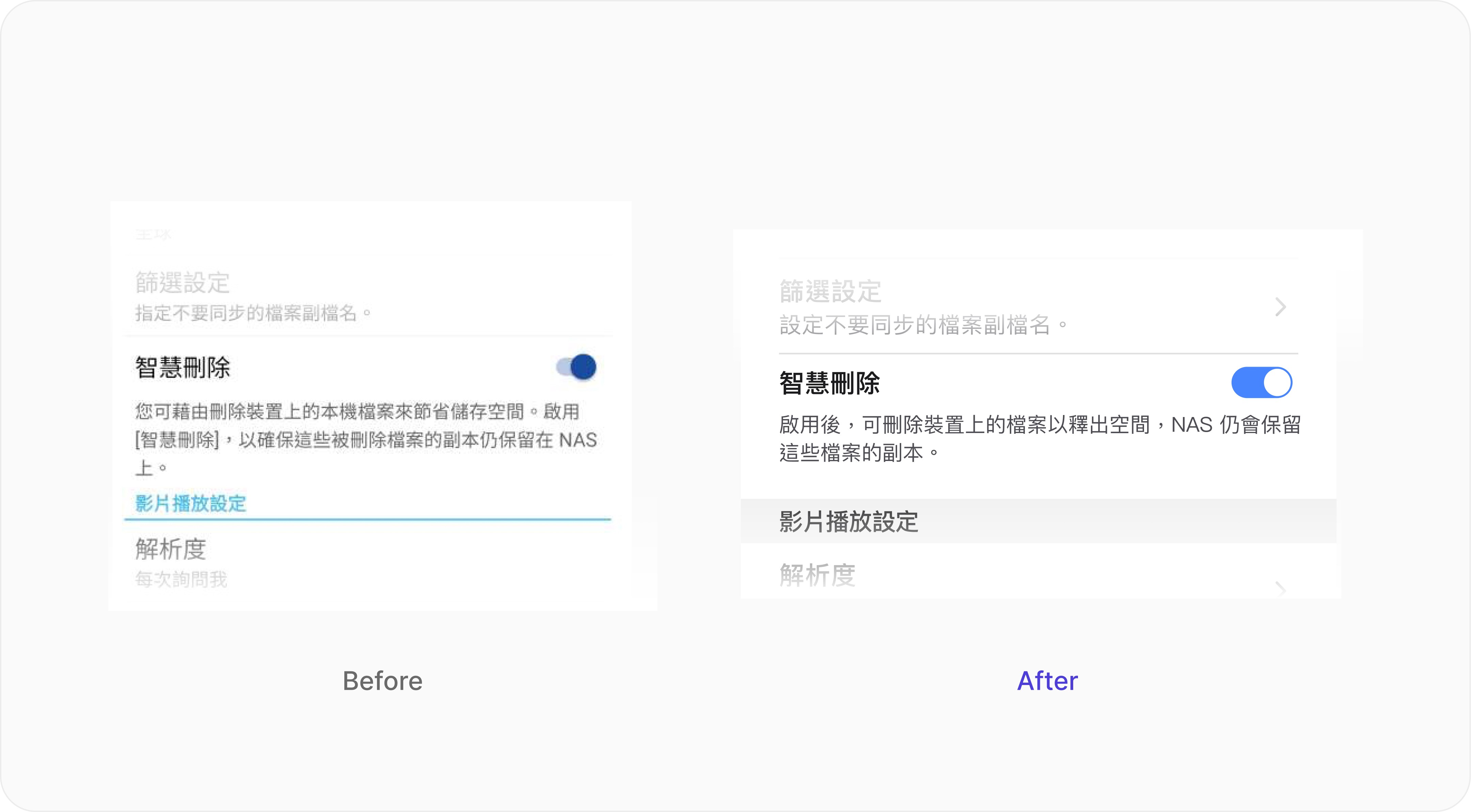
Simple & Friendly Copywriting
Users frequently complained about text overload and confusing instructions. I rewrote the copy to be simpler, more intuitive, and friendlier.
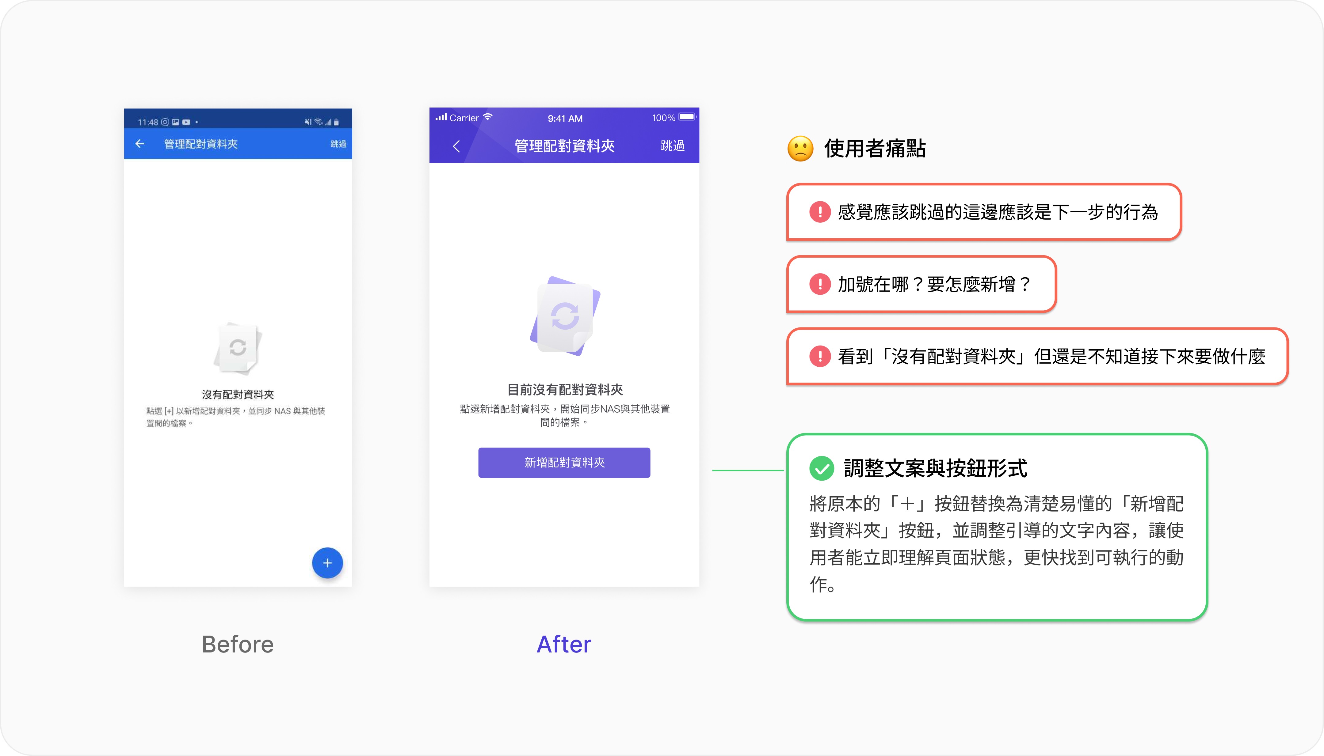
We also redefined interface guidance. For empty states, I added clear Call-to-Action buttons and instructional text to tell users exactly what to do next, effectively reducing hesitation and friction.
Modernized Design System
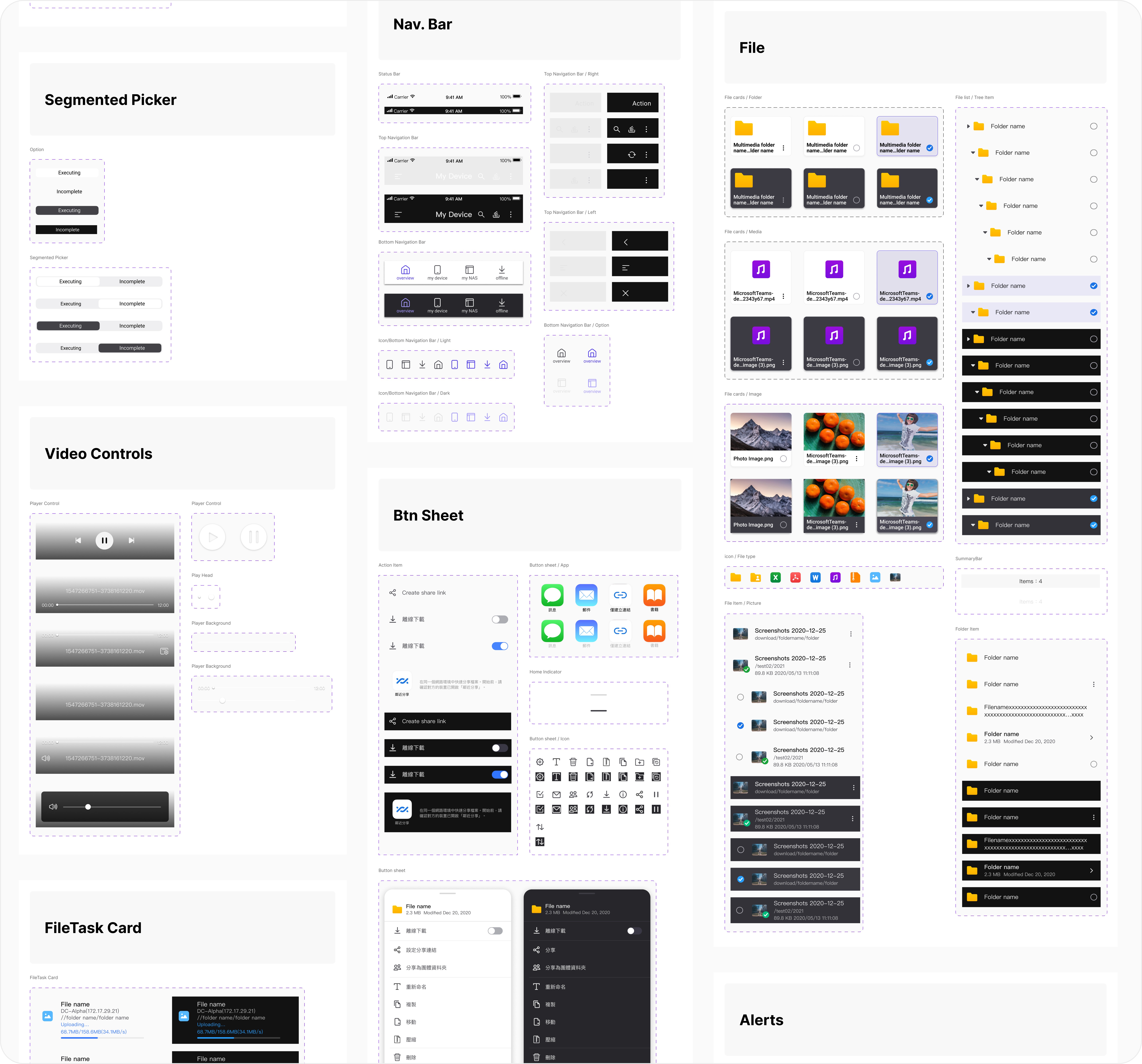
I revamped the Design System to give the product a fresh, modern look and feel.
Results & Impact
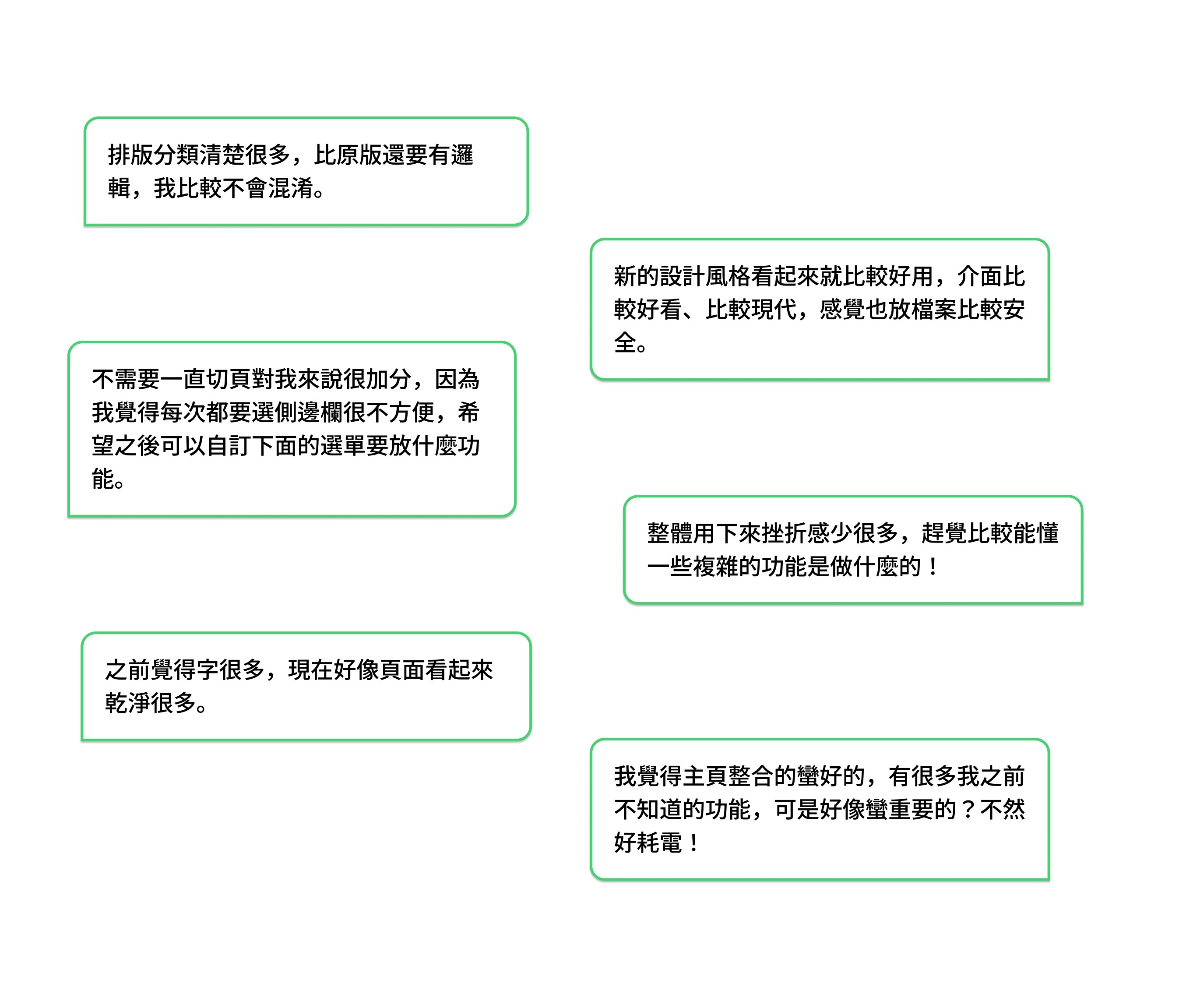
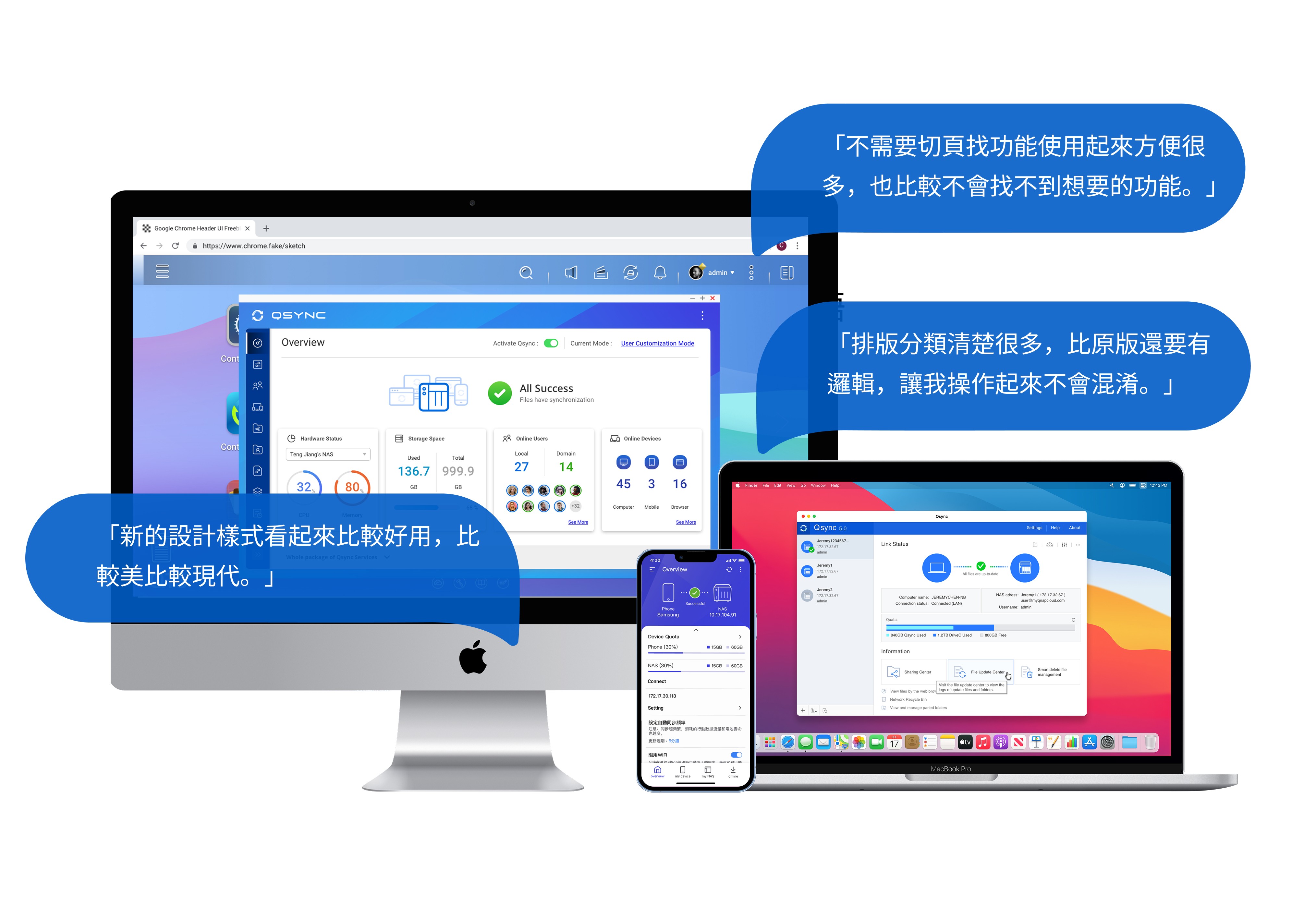
Before launch, we conducted usability testing to validate the new design. The revamp received positive feedback from users.
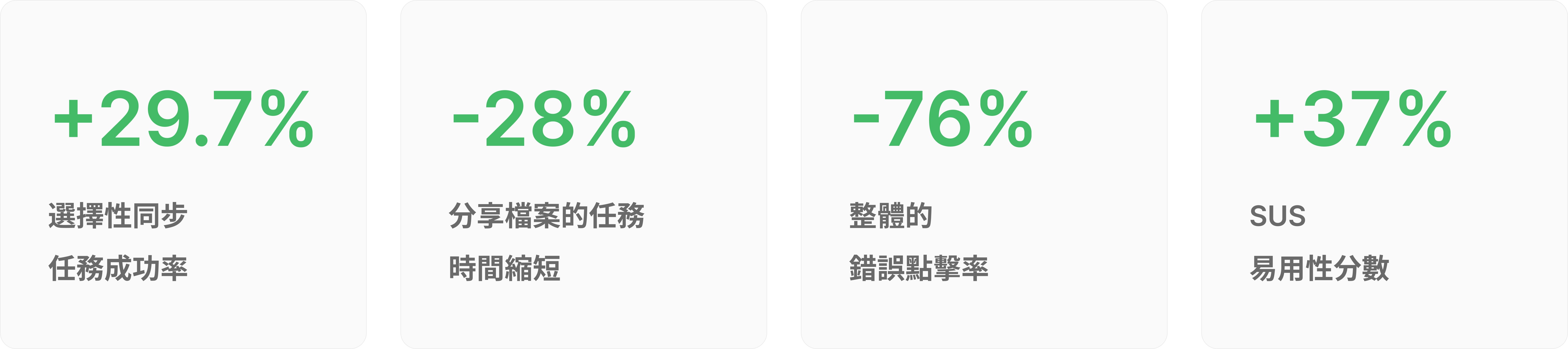
Overall, users found the product easier to use and the style more modern. They quickly understood how to use features that were previously difficult. The improved information architecture and clear copy significantly reduced cognitive load and user frustration. This successfully transformed Qsync from a complex technical tool into a trusted private cloud assistant.
Cross-Platform Consistency
Starting with the mobile app, I extended the new visual system to the Utility and Web versions. This ensured a consistent user experience across all three platforms.
Reflections & Learnings
Listening to Users: Pain-Point Driven Strategy
The success of this project came from prioritizing the user's voice. The design process was driven by user pain points rather than technical constraints or internal assumptions. We not only validated expected usability issues but also uncovered deep, unexpected frustrations. These insights drove fundamental changes to the language and architecture, ensuring the final product was truly meaningful to users.
Building a Shared Vision: UJM as an Empathy Tool
Visualizing pain points helped the team see exactly where users felt frustrated or failed tasks. Aligning the entire team on these user struggles allowed us to build a consistent and reliable product from the ground up.